Understanding the Calming Effect of Colors in Preschoolers’ Drawings
Preschoolers’ fascination with painting and drawing is not just a creative outlet but a crucial aspect of their emotional and cognitive development. Beyond the strokes and shapes, the colors they choose play a significant role in influencing their attitudes and behaviors. In this article, we’ll delve into the meaning of colors in preschoolers’ drawings, focusing on the calming effect that certain colors can have on their artistic expressions.
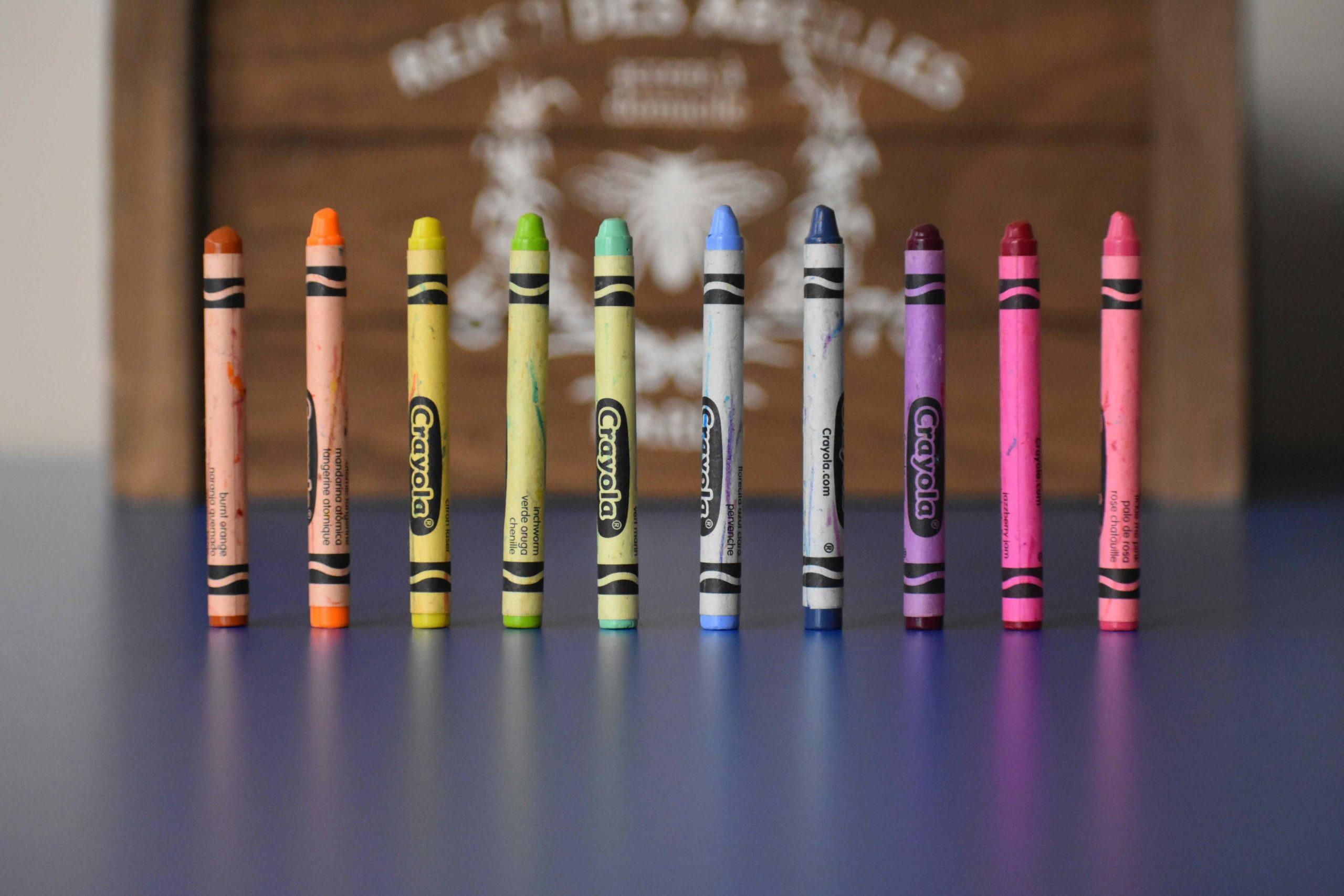
The Meaning of Colors in Preschoolers’ Drawings
Red: A vibrant color symbolizing vigor and excitement, red is often used by preschoolers to express enthusiasm or passion. However, its overuse can be overwhelming. To encourage a calming effect, it’s advised to use red sparingly.
Blue: A calming hue associated with tranquility and peace, blue is frequently chosen by preschoolers when they feel calm or relaxed. It can also represent sadness or isolation, making it an ideal color to promote a calming effect in their drawings.
Green: Symbolizing growth, harmony, and balance, green is chosen by content and peaceful preschoolers. While it can also represent envy, using green fosters a sense of harmony and balance in their drawings.
Yellow: A happy and upbeat color invoking joy, yellow is often chosen by excited preschoolers. However, it can also symbolize caution or fear. Using yellow sparingly is recommended to prevent overstimulation and encourage a calming effect.
Purple: Representing imagination and creativity, purple is chosen by preschoolers feeling imaginative or creative. It may also signify opulence or royalty, making it an excellent color to encourage creativity in their drawings.
Orange: A vibrant and warm color associated with excitement and enthusiasm, orange is chosen by preschoolers feeling passionate. Yet, it can also indicate hostility or agitation. Using it judiciously allows preschoolers to convey emotions and foster a calming effect.
Strategies for Encouraging Calming Colors
- Set the mood with colors: Establish specific atmospheres for activities using colors. Blue and green promote peace and relaxation, making them ideal for reading or naptime.
- Avoid overly stimulating colors: Red and yellow, if overused, can lead to hyperactivity and restlessness. Encouraging a calming effect requires using these colors judiciously.
The Impact of Color Choice on Preschoolers’ Mood and Behavior
Preschoolers’ mood and behavior are significantly influenced by color choices. Blue and green are associated with calmness, while red and yellow evoke energy and excitement. Creating environments with soothing colors can impact sleep and relaxation, while encouraging specific color choices in drawings can support emotional well-being.
The Importance of Allowing Preschoolers to Choose Their Own Colors
Granting preschoolers the freedom to choose their colors fosters independence and self-assurance. This freedom allows them to express their unique personalities, boosting self-worth. Additionally, it encourages exploration and self-discovery as preschoolers experiment with various color schemes.
In conclusion, understanding the calming effect of colors in preschoolers’ drawings involves recognizing the meanings associated with each color and employing strategies to encourage a soothing atmosphere. By considering the impact of color choices on mood and behavior, as well as allowing preschoolers to make their own color decisions, parents and educators can contribute to their emotional development and overall well-being.

Archives
Categories
- Articles
- E-preschool Enrichment
- Jumpstart Preschool
- Montessori Preschool
- Online Preschool
- Preschool
- Preschool Activities
- Preschool Age
- Preschool Apps
- Preschool Art Projects
- Preschool Assessment
- Preschool Assessment Tests
- Preschool Books
- Preschool Bulletin Board Ideas
- Preschool Classroom
- Preschool Coloring Pages
- Preschool Crafts
- Preschool Curriculum
- Preschool Design Ideas
- Preschool Developmental Milestone
- Preschool Drawing
- Preschool Education
- Preschool Fees
- Preschool Field Trip
- Preschool Fire Drills
- Preschool Flashcards
- Preschool For Special Needs
- Preschool Games
- Preschool Goodbye Sayings
- Preschool Goodie Bag Ideas
- Preschool Home Tutor
- Preschool Homeschool
- Preschool Homework
- Preschool Hours
- Preschool Jokes
- Preschool Kids
- Preschool Kit
- Preschool Learning
- Preschool Learning Journey
- Preschool Lesson Plans
- Preschool Levels
- Preschool Lunch Ideas
- Preschool Market
- Preschool Math
- Preschool Meaning
- Preschool Multiple Intelligences
- Preschool Music
- Preschool Newsletter
- Preschool Outdoor Activities
- Preschool Phonics
- Preschool Poem
- Preschool Printables
- Preschool Programmes
- Preschool Quotes
- Preschool Readiness
- Preschool Reading
- Preschool Science Experiments
- Preschool Songs
- Preschool Syllabus
- Preschool Teacher
- Preschool Themes
- Preschool Units
- Preschool Words
- Preschool Workbooks
- Preschool Worksheets
- Preschool Writing Prompts
- Preschool Zoom Backgrounds
- Preschooler
- Transitional Preschool
- Uncategorized
- Virtual Preschool